

Overview
This guide shows practical, minimal workflows in Jupyter for Kaggle/ML:
tabular EDA (pandas + matplotlib) and image preprocessing (PIL).
Follow the step-by-step cells, copy/paste, and modify paths under /workspace.
Tip: Keep projects tidy:
/workspace/data (inputs), /workspace/notebooks (ipynb),
/workspace/outputs (cleaned CSVs, plots), /workspace/runs (logs).
Project layout
/workspace/
  data/
    tabular/     # CSVs, Parquet, etc.
    images/      # raw images (originals)
  outputs/
    clean/       # cleaned CSVs, deduped images
    plots/       # exported figures (.png)
  notebooks/
  runs/
Tabular EDA — pandas + matplotlib
Install (once per kernel), then import and load a CSV:
# Install in current kernel (one-time per kernel)
%pip install pandas matplotlib --quiet


import pandas as pd
import matplotlib.pyplot as plt
import numpy as np


# Load a CSV from your workspace
df = pd.read_csv('/workspace/data/tabular/sample.csv')


# Quick peek
print(df.head(3))
print(df.shape, df.dtypes)
Missing values & types
# Missing counts
na = df.isna().sum().sort_values(ascending=False)
print(na[na>0])


# Simple impute (example): fill numeric with median, categorical with mode
num_cols = df.select_dtypes(include=[np.number]).columns
cat_cols = df.select_dtypes(exclude=[np.number]).columns


df[num_cols] = df[num_cols].fillna(df[num_cols].median())
for c in cat_cols:
    if df[c].isna().any():
        df[c] = df[c].fillna(df[c].mode().iloc[0])
Basic distributions
# Histogram (numeric column)
col = 'age'  # change to your numeric column
plt.figure()
df[col].plot(kind='hist', bins=30)
plt.title(f'Distribution of {col}')
plt.xlabel(col); plt.ylabel('count')
plt.tight_layout()
plt.savefig('/workspace/outputs/plots/hist_age.png'); plt.show()
# Boxplot (by category)
num_col = 'income'
cat_col = 'region'
plt.figure()
df.boxplot(column=num_col, by=cat_col, grid=False, rot=30)
plt.title(f'{num_col} by {cat_col}')
plt.suptitle('')
plt.tight_layout()
plt.savefig('/workspace/outputs/plots/box_income_by_region.png'); plt.show()
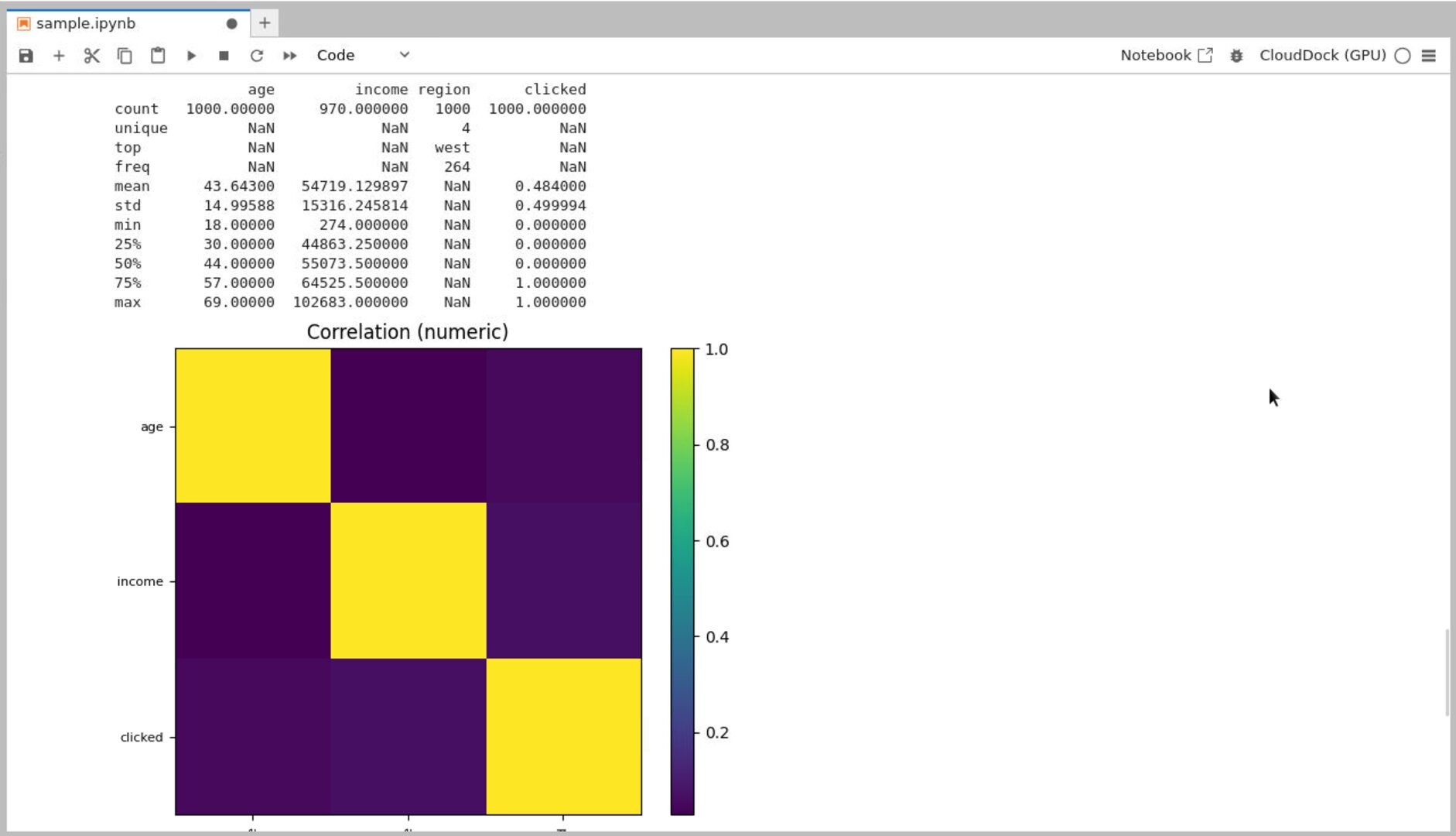
Feature sanity & correlations
# Quick describe
desc = df.describe(include='all')
print(desc)


# Numeric correlation heatmap (minimal, no seaborn)
num = df.select_dtypes(include=[np.number])
corr = num.corr(numeric_only=True)
plt.figure(figsize=(6,5))
plt.imshow(corr, cmap='viridis')  # quick view
plt.colorbar()
plt.xticks(range(len(num.columns)), num.columns, rotation=90, fontsize=8)
plt.yticks(range(len(num.columns)), num.columns, fontsize=8)
plt.title('Correlation (numeric)')
plt.tight_layout()
plt.savefig('/workspace/outputs/plots/corr_numeric.png'); plt.show()
Clean & export
# Example cleanups
# 1) Drop exact duplicates
df = df.drop_duplicates()


# 2) Clip outliers (replace with quantile caps)
for c in num_cols:
    q_low, q_hi = df[c].quantile([0.01, 0.99])
    df[c] = df[c].clip(q_low, q_hi)


# 3) Save cleaned CSV
out_path = '/workspace/outputs/clean/sample_clean.csv'
df.to_csv(out_path, index=False)
print('Saved:', out_path)
pandas
describe() — fast sanity check.
Distribution histogram exported to
outputs/plots/.
Heads-up: For very large CSVs, prefer chunked reads:
pd.read_csv(path, chunksize=100_000) and process in a loop.
Image preprocessing — PIL (Pillow)
Unify size/format, sanitize filenames, and build a 3×3 sanity grid for quick QA.
%pip install pillow --quiet


from PIL import Image
from pathlib import Path
import re


src = Path('/workspace/data/images').expanduser()     # raw images
dst = Path('/workspace/outputs/clean/images').expanduser()
dst.mkdir(parents=True, exist_ok=True)


def sanitize(name: str) -> str:
    # keep letters, digits, dash, underscore, dot
    return re.sub(r'[^A-Za-z0-9._-]+', '_', name)


long_side = 768  # change if you need different target
count = 0


for p in sorted(src.glob('**/*')):
    if not p.is_file():
        continue
    try:
        im = Image.open(p).convert('RGB')
    except Exception:
        continue  # skip non-images


    w, h = im.size
    if w >= h:
        new_w = long_side
        new_h = int(h * long_side / w)
    else:
        new_h = long_side
        new_w = int(w * long_side / h)
    im = im.resize((new_w, new_h), Image.BICUBIC)


    safe = sanitize(p.stem) + '.jpg'
    im.save(dst / safe, quality=90)
    count += 1


print('processed:', count, '→', dst)
3×3 sanity grid
import random
from PIL import Image, ImageOps


thumb = 256  # per tile
tiles = 3    # 3x3 grid
canvas = Image.new('RGB', (thumb*tiles, thumb*tiles), (240,240,240))


items = list((dst).glob('*.jpg'))
sample = random.sample(items, k=min(tiles*tiles, len(items)))


for idx, path in enumerate(sample):
    r = idx // tiles
    c = idx % tiles
    im = Image.open(path)
    im = ImageOps.fit(im, (thumb, thumb), Image.BICUBIC, bleed=0.01)
    canvas.paste(im, (c*thumb, r*thumb))


grid_path = '/workspace/outputs/plots/sanity_grid.png'
canvas.save(grid_path)
print('Saved grid:', grid_path)
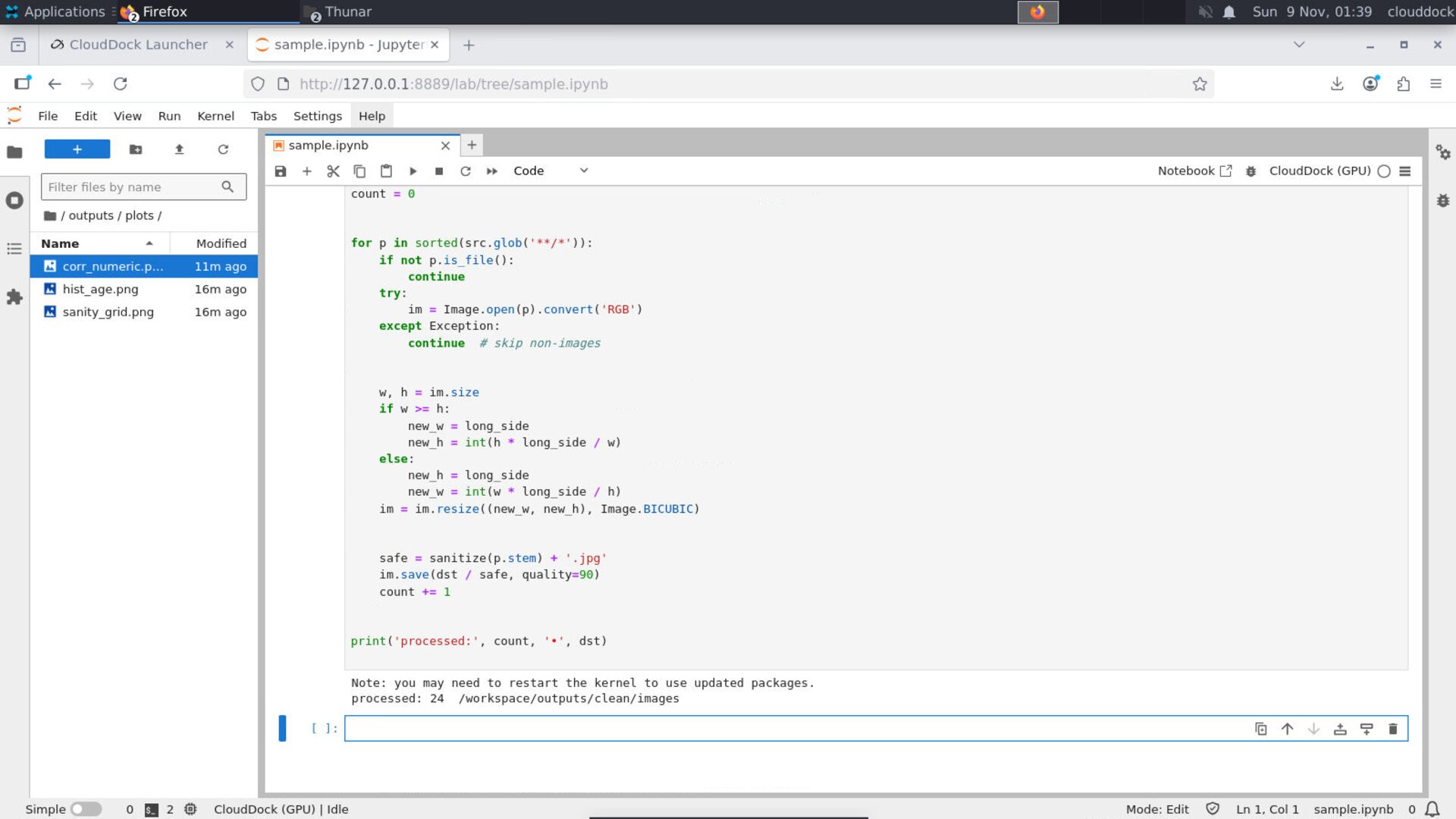
One-pass resize & unify — drop-in cell.

3×3 sanity grid — quick visual QA.
Optional: label mapping CSV
If your images are organized as class_name/filename.jpg, build a CSV for training:
import csv
rows = []
for p in sorted(src.glob('*/*.jpg')):
    cls = p.parent.name
    rows.append({'path': str(p), 'label': cls})
out_csv = '/workspace/outputs/clean/image_labels.csv'
Path(out_csv).expanduser().parent.mkdir(parents=True, exist_ok=True)
with open(Path(out_csv).expanduser(), 'w', newline='') as f:
    writer = csv.DictWriter(f, fieldnames=['path','label'])
    writer.writeheader(); writer.writerows(rows)
print('Saved:', out_csv, 'rows:', len(rows))
Tips
- Keep originals: never overwrite raw images; write cleaned copies to
outputs/. - Record params: save resize long_side, filename rules, and any filters in a README or notebook cell.
- Tabular outliers: always inspect percentiles and clip gently; keep a log of what you changed.
FAQ
My notebook says “ModuleNotFoundError: pandas”
Install into the current kernel with %pip install pandas, then re-run the cell.
The histogram looks weird (spiky or flat)
Try different bin counts (e.g., 20/40), or inspect min/max and clip extreme outliers before plotting.
Images got stretched
Use the ImageOps.fit(...) path (keeps aspect) or verify you computed new_w/new_h correctly.
Garbage in, garbage out — let’s fix the garbage first.