Why Lineart + Depth works
When you prompt from scratch, SD has to decide everything at once: shape, composition, lighting, and style. That’s why images drift — and why consistency can be painful.
Lineart + Depth is a more controlled workflow:
Shape first, color later.
Use Lineart to lock edges and silhouette, use Depth to lock perspective and spacing, then let the prompt “paint” style and color on top.
Use Lineart to lock edges and silhouette, use Depth to lock perspective and spacing, then let the prompt “paint” style and color on top.
Best use cases
- Redrawing an existing sketch into anime style
- Keeping composition stable across iterations
- Preventing background drift while you refine character design
- Turning rough concept art into a cleaner render
The pipeline (two controls, one clean result)
- Lineart controls edges and shape (the “drawing”).
- Depth controls 3D layout and distance (the “stage”).
- Your prompt controls style, color, mood (the “painting”).
Structure first. Style second. Cleaner results, less drift.
What you need (inputs)
- A source image (sketch, draft, or even a messy render)
- ControlNet enabled in A1111
- Two slots: Lineart + Depth
Tip: This pipeline works best when the source image has clear separation:
readable lines + readable foreground/background. If everything is muddy, fix contrast first.
Preset: Lineart + Depth (recommended)
ControlNet #1 — Lineart (shape lock)
- Weight:
0.70–0.95 - Start / End:
0.00 → 0.85 - Goal: keep silhouette and edges stable
ControlNet #2 — Depth (space lock)
- Weight:
0.45–0.70 - Start / End:
0.10 → 0.90 - Goal: keep perspective and spacing consistent
Why depth is softer than lineart:
Depth should guide layout, not freeze the entire render into a plastic 3D look.
Let lineart do the hard “shape lock,” let depth do gentle “stage direction.”
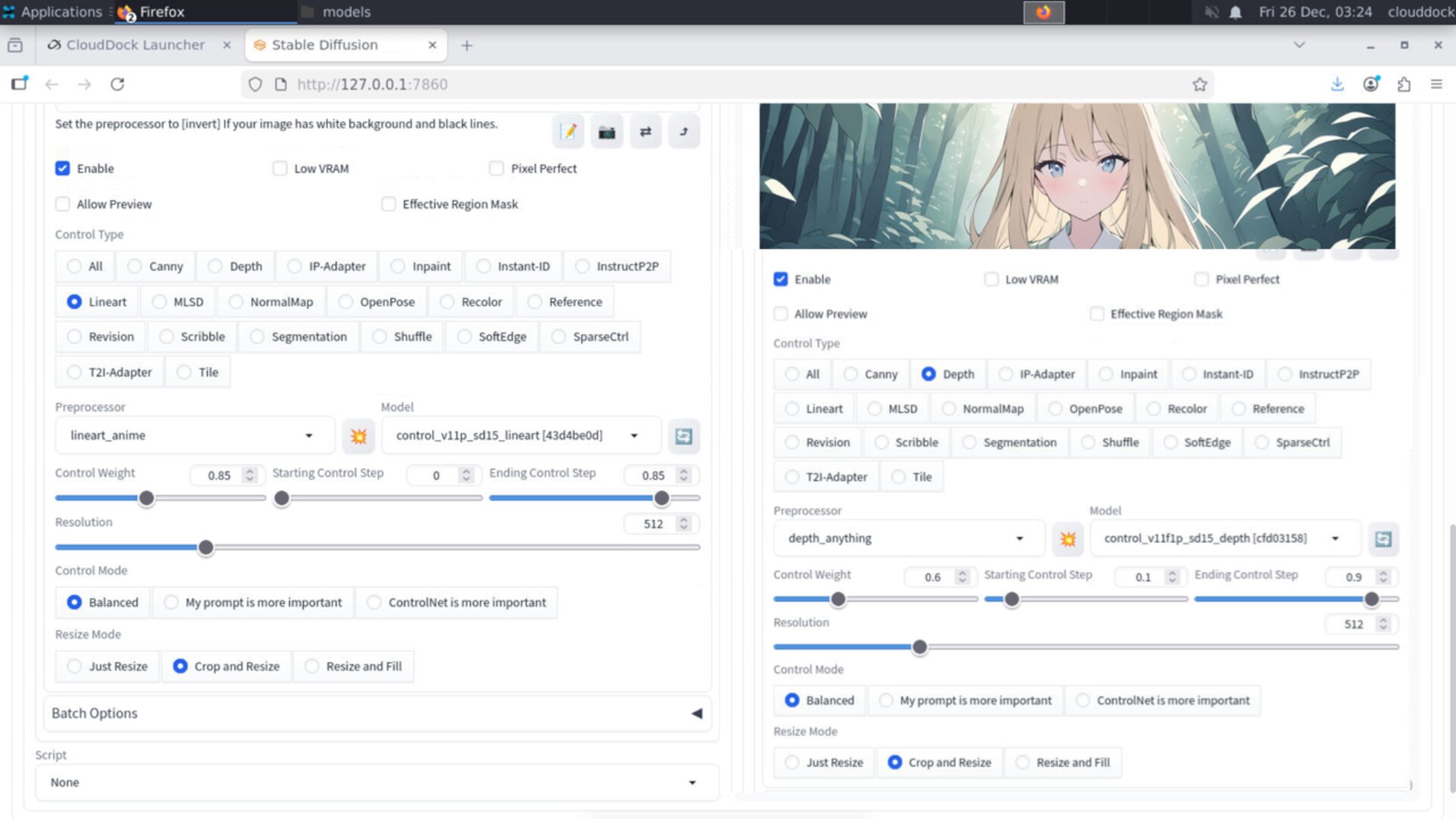
Lineart strong, depth medium: stable composition without stiffness.
Prompting: how to “paint” on top
With Lineart + Depth handling structure, your prompt should focus on:
- style (anime, clean lineart, cel shading, soft painterly, etc.)
- lighting (sunset rim light, studio softbox, neon city)
- color palette (pastel, high contrast, monochrome)
- material / texture (silk, denim, glossy armor)
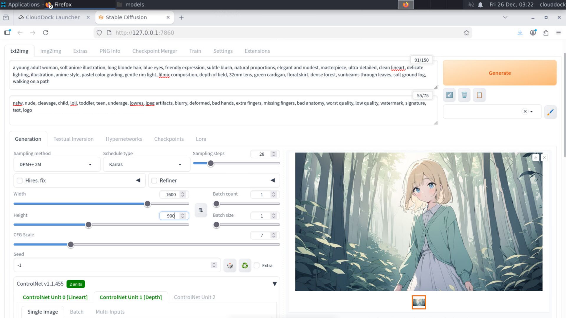
Example prompt:
anime illustration, clean lineart, cel shading, soft gradient background,
cinematic lighting, warm color palette, detailed eyes, sharp focus
Negative starter:
blurry, lowres, bad anatomy, extra limbs, deformed hands,
messy lines, oversharp, noisy background, worst quality
Common mistakes (and quick fixes)
“It looks stiff / traced.”
- Lower Lineart weight to
0.65–0.80 - End Lineart earlier (
end 0.75–0.85) - Let the last steps add style detail naturally
“Depth makes it look 3D/plastic.”
- Lower Depth weight to
0.40–0.55 - Start Depth later (
start 0.15–0.25) - Make depth influence less dominant than lineart
“Background still drifts.”
- Increase Depth weight slightly (
+0.05) - Use a cleaner source image (better contrast / clearer background)
- Reduce denoising if you’re using img2img
VRAM notes (A-group)
Two ControlNets cost VRAM. Keep the workflow stable by staying modest:
- Batch size 1
- Moderate base resolutions (don’t start huge)
- If you use hires, use the 1.3× ladder and low denoise
OOM survival rule: reduce base resolution first.
Cutting a few steps won’t save you if the canvas is too large.
What’s next?
-
Pose · Hand · Face presets: hands strong, faces medium, body soft.
Go to “Pose · Hand · Face →” -
Two-stage hires ladder: 1.3× first, low-noise repair second.
Go to “Two-stage Hires →” -
img2img Basics: denoise logic + inpaint repair.
Go to “img2img Basics →”
Lock the shape. Paint the vibe.